
INTERIOR ART23/9/2015
I think that Cox London share the vision of the Carpenters Workshops, who work more with artists to design functional sculpture for interiors. Willer, a gallery founded by Rebecca Willer also offers a unique approach to design and art for interiors.
‘For years we made each piece ourselves, from pouring the bronze, fabricating the metal work and cutting and fitting glass. Today we throw our concepts to an even more experienced and versatile workshop. As well as the commissioned work we are always experimenting as we create totally contemporary designs along side more traditional and 20th century pieces with an onus on limited edition art work.' Christopher and Nicola Cox 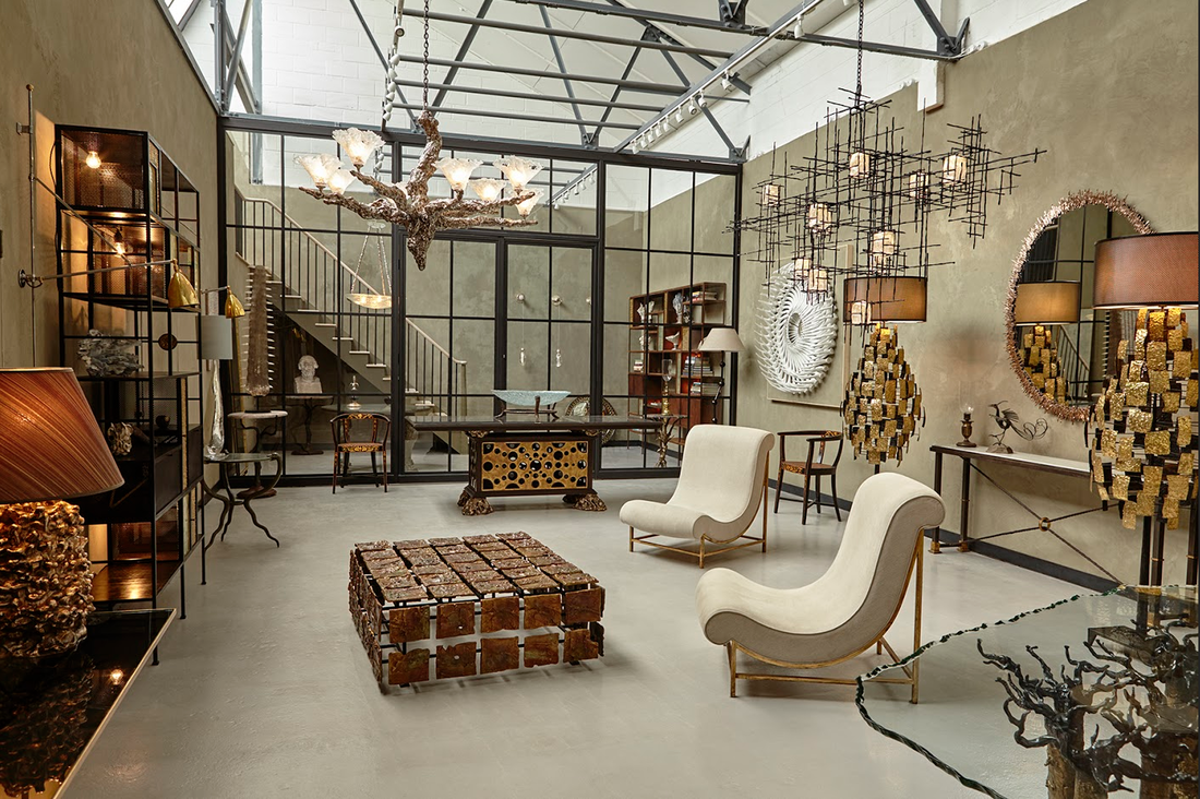
Cox London design and make their interior pieces. Both sculptors and talented technicians, they began collaborating at art school in the mid 1990s and today have a London gallery, studio and workshop where they run an in house team of specialist artisans.
Each piece is infused with inventiveness and rooted with a deep knowledge and understanding of traditional techniques and materials - bronze, wrought iron, blown glass and stone. Their enduring ambition is to create interior sculpture - the highest quality collectibles of the future and they regularly produce works to commission. These sculptural works prize a rarefied beauty in a modern age and are destined for the interior spaces of collectors and designers worldwide. The new Cox London gallery is now open by appointment. coxlondon.com PATTERN15/9/2015
A good few years ago now I remember hearing the name of Ben Pentreath crop up in conversations with architectural designer Charles Morris and Monica Grose-Hodge of The Art Workers Guild. It was Ben this and Ben that and just how-does-he-do-it remarks. When I met Ben it was pretty clear why he had such a loyal following. I guess I have joined this merry troupe.
Ben Pentreath is an interior and architectural designer, shopkeeper, author and journalist. From his two design studios in the heart of London’s Bloomsbury, Ben works on a huge variety of buildings. He is renowned for his fresh approach to classical and traditional design and injects a strong use of colour and pattern into his interiors. Pentreath & Hall, which Ben co-founded with Artist and Maker Bridie Hall, is one of the liveliest and most written about small shops in London. Both are creating a new British tradition that respects the past but is never dull, and both bring a powerful creative dynamic to the shop that they have run together since 2008. This dynamic is now seen in the new Ben Pentreath for Alternative Flooring carpet collection and Ben has written a brilliant guest blog about this collaboration. 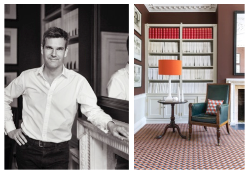
Here are the final paragraphs and I urge you to read his blog in full.
‘A year ago, I was asked by Alternative to collaborate on a range of carpets for their already well-established ‘QuirkyB’ line. It didn’t take long to realise what I wanted to do. Batty’s patterns had come off the floor, and I wanted to put them straight back. Finally, the terrifying moment when you see the first large-scale piece of carpet in a room set – ready for my portrait to be taken. I stared, and blinked. The pattern was intense, in a way that set my heart racing. It looked absolutely beautiful, and we’re getting our office boardroom carpeted with some of that first carpet to run off the mills right now. And in terms of the zeitgeist – I thought… yes, this is good. But I take even more comfort in knowing that there’s something a little bit Georgian, and a little bit 1970s in my carpet patterns. Because most importantly of all, I think this means that they might just stand the test of time – and that’s the only test I’m really interested in.’ alternativeflooring.com/blog/ alternativeflooring.com/collection/quirky_b Ben Pentreath for Alternative Flooring launches on Alternative Flooring Stand C21 at Decorex, 20 – 23 September, 2015. OCHRE Colour Essay: Blue-Grey8/9/2015
This is the evocative interview that Jill Macnair conducted with Ochre’s Harriet Maxwell MacDonald for Farrow & Ball’s The Chromologist.
I love the sensory words so much that this colour essay is this week’s blog. Here’s what Harriet Maxwell MacDonald of Ochre has to say on this particular shade of blue-grey. The colour I love is a layered and fluid colour, rather than a solid one, one that moves between a slate blue grey and a grey aqua. It’s soothing and calm, textural and multi-layered. It changes according to the context it is in and it can activate and emphasise other colours. More often than not this greyish aqua colour is a base to add a dash of interest/colour with an accessory. 
It conjures images of the sea and the sky, landscapes that have been there for the millennia, rocks, earth, water, stormy skies, and fog. You can see it anytime you’ve stood still looking at a landscape far away, or near the sea. For me maybe the softness of the west coast of Scotland, or the light on the sea, ever changing, on Shelter Island.
My emotion towards colour is always the same within work or outside it – though we do look at colour in a different way when we are exhibiting in an exhibition hall under artificial light. At Ochre we have always enjoyed playing with different colour combinations and this shade is always a base colour for us, but the combinations or juxtapositions we use might change. Colours that work well with it are yellows, limes, greens, oranges, reds, crimsons, gold and silver – almost everything! There are no hard and fast rules for combining colours in the home or in what you wear, but playing with complimentary opposites is often a good starting point. We are never so drawn to brittle colours as the dominant tone, but these sorts of shades can work for us when there is just a flash of it. And we always colour test our pieces with Blue the whippet who looks delicious with almost everything. If this colour had a taste it would be pure and fluid, like water. An essential ingredient, something that can take on another dimension when a twist of lime is added, or a sprig of mint, or a strawberry. It would sound like the sea or the wind rustling through the leaves of a tree, maybe with a little birdsong in the background. Or the music of a harp. As a tertiary colour it combines the history of several colours – originally the pigments coming mainly from rocks and plants. It feels timeless, nostalgic, and sometimes a bit of emptiness and sadness, delicacy and fragility – befitting of the Yves Klein quote: ‘To sense the soul, without explanation, without words.’ thechromologist.com |
