OCHRE Colour Essay: Blue-Grey8/9/2015
This is the evocative interview that Jill Macnair conducted with Ochre’s Harriet Maxwell MacDonald for Farrow & Ball’s The Chromologist.
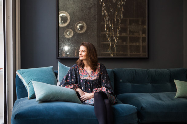
I love the sensory words so much that this colour essay is this week’s blog. Here’s what Harriet Maxwell MacDonald of Ochre has to say on this particular shade of blue-grey. The colour I love is a layered and fluid colour, rather than a solid one, one that moves between a slate blue grey and a grey aqua. It’s soothing and calm, textural and multi-layered. It changes according to the context it is in and it can activate and emphasise other colours. More often than not this greyish aqua colour is a base to add a dash of interest/colour with an accessory.
It conjures images of the sea and the sky, landscapes that have been there for the millennia, rocks, earth, water, stormy skies, and fog. You can see it anytime you’ve stood still looking at a landscape far away, or near the sea. For me maybe the softness of the west coast of Scotland, or the light on the sea, ever changing, on Shelter Island.
My emotion towards colour is always the same within work or outside it – though we do look at colour in a different way when we are exhibiting in an exhibition hall under artificial light. At Ochre we have always enjoyed playing with different colour combinations and this shade is always a base colour for us, but the combinations or juxtapositions we use might change. Colours that work well with it are yellows, limes, greens, oranges, reds, crimsons, gold and silver – almost everything! There are no hard and fast rules for combining colours in the home or in what you wear, but playing with complimentary opposites is often a good starting point. We are never so drawn to brittle colours as the dominant tone, but these sorts of shades can work for us when there is just a flash of it. And we always colour test our pieces with Blue the whippet who looks delicious with almost everything. If this colour had a taste it would be pure and fluid, like water. An essential ingredient, something that can take on another dimension when a twist of lime is added, or a sprig of mint, or a strawberry. It would sound like the sea or the wind rustling through the leaves of a tree, maybe with a little birdsong in the background. Or the music of a harp. As a tertiary colour it combines the history of several colours – originally the pigments coming mainly from rocks and plants. It feels timeless, nostalgic, and sometimes a bit of emptiness and sadness, delicacy and fragility – befitting of the Yves Klein quote: ‘To sense the soul, without explanation, without words.’ thechromologist.com Comments are closed.
Categories
All
Archives
April 2020
|


